User Review
( votes)In Dynamics CRM wave2 many enhancements are added. The additional charts customization options are added in the wave2. Charts are used to show a visual representation of the data. To make chart visualization more friendly and attractive, in wave2 following options are provided. It includes the addition of support for gridline color, grid tick marks, data label color, data label hiding, axis label hiding, and axis line color. On funnel charts, the neck height and neck width can be defined to adjust the bottom tapering. On the pie, funnel, and multiple donut charts, support was added for border width and border color to enable more visual definition.
To do this charts customization, please follow the below steps:
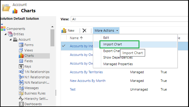
1. Go -> Customization -> customize the system -> then Select the entity for which you want to make customization of the charts. Say suppose Account, then go to the Charts section and select chart those you want to customize and click on Export Chart as shown below.

2. Once you click on the “Export Chart” button then it downloads the chart in .xml format. To make customization, open the chart XML in VS studio or in notepad or in any editor. To make changes like x- Axis title color, font size, etc and show the grid-like structure and change grid line color as shown below.

3. Once you make changes as per your need, save the changes. After that, import the chart again in Dynamics CRM using the Import chart button as shown below.
Once charts are imported successfully then publish the customization to make the effect.
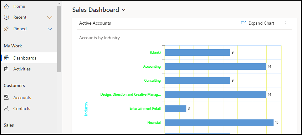
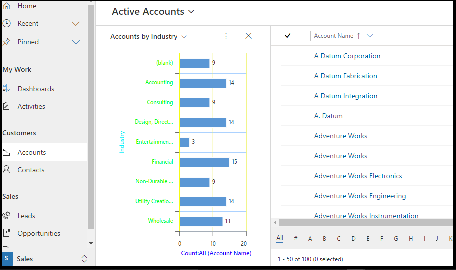
Here is the screenshot of the charts before and after customization.
Before Customization:

After Customization:
Conclusion
With the help of chart customization, we can make charts for user friendly and as per company standard and even more attractive.
